Dyson: Sub-System Design

Designing a Sub-System Inside a Global Brand


Role: Creative Director / Art Director
Focus: 
Brand governance · Design systems · Cross-media consistency


Context:

Dyson is one of the most rigorously governed global brands in consumer technology. Its visual identity is highly recognizable, technically precise, and tightly controlled — by necessity.

The challenge was not to “refresh” or reinterpret the brand, but to create design expressions that live inside the systemwhile remaining clearly distinguishable, functional, and relevant to their specific communication contexts.

The Challenge

When a brand system is as strong as Dyson’s, differentiation becomes a paradox.

The work had to:

  • Fully respect Dyson’s global brand guidelines
  • Avoid visual dilution or stylistic deviation
  • Still feel purpose-built, not generic
  • Solve specific communication problems without breaking the system
  • In practice, this meant designing a sub-system — not a new identity, and not a decorative variation.


My Role

I was responsible for art direction and design development within defined brand constraints, working closely with stakeholders to ensure alignment between brand governance and communication needs.

This required reading the guidelines not as a rulebook, but as a design logic — understanding where flexibility existed, and where it did not.


The Systemic Approach

Instead of introducing new visual elements, I focused on:

  • Hierarchy and composition
  • Typographic rhythm
  • Controlled variation in layout logic
  • Context-specific emphasis rather than stylistic novelty

By operating at the level of structure rather than surface, the resulting work felt distinct without ever contradicting Dyson’s brand language.

Outcome

  • Clear, recognizable Dyson communication that avoided visual repetition
  • Design solutions tailored to their specific use cases
  • Full brand compliance without creative stagnation
  • A repeatable approach for future executions within the same constraints


Why This Matters

Strong brands don’t need constant reinvention — they need intelligent interpretation.
Designing within constraints is where systems thinking becomes visible.

A variety of posters from Netflix productions spread out on a black background.
By Jean-Philippe Ili January 28, 2026
How I improved coherence and efficiency in Netflix’s EMEA campaign localization by designing governance systems that preserve creative intent across markets.
Sensos logo on a cinematic black background, representing a bold, high-tech brand identity
By Jean-Philippe Ili January 21, 2026
Brand system and sales enablement work for Sensos, a logistics tech startup, designed to support C-suite communication, scalability, and consistent brand use.
Book cover of “Die Vermessung Berlins” with red background, yellow bear illustration, title text, an
By Jean-Philippe Ili December 19, 2025
Measuring Berlin is an infographics book exploring unexpected data about the German capital, visual storytelling, and the making of a first publication.
Agua de México, 1840 Edition: Tequila Blanco, Reposado and Añejo.
By Jean-Philippe Ili January 14, 2024
Luxury brand system design for Agua de México, balancing cultural depth, restraint, and scalability to establish credibility without relying on large launch budgets.
A sunny background and a mouth full of life in the front: Get punchie!
By Jean-Philippe Ili November 7, 2023
Brand design and launch strategy for PUNCHIE, a hard seltzer brand entering a saturated FMCG market with a premium positioning and lifestyle focus.
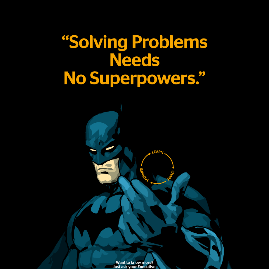
Next to Batman, a quote:
By JPdoes December 3, 2022
Internal communication design for Continental, translating knowledge-sharing principles into a scalable visual system that supports clarity and reuse.
By JPdoes December 1, 2022
Handelsblatt — Student Campaign on Instagram Stories Year: 2021 Context: Digital campaign for Handelsblatt targeting students. Market research had shown untapped potential in this audience, particularly through Instagram Stories rather than traditional digital advertising formats. My role: Creative Director. I led the creative direction of the campaign, defining the visual and narrative framework and guiding execution across formats. Project type: Digital campaign · Social media advertising · Creative direction
 An ad for the German magazine WirtschaftsWoche showing a confident female founder
By JPdoes November 29, 2022
How design systems were used at WirtschaftsWoche to break organizational silos, align teams, and create sustainable cross-media communication structures.
A smartphone displaying the top of an interactive infographic dossier – a long read, in graphs only
By JPdoes November 28, 2022
A mobile-first infographic production system enabling fast, responsive editorial output without coding, reducing complexity and supporting sustainable workflows.
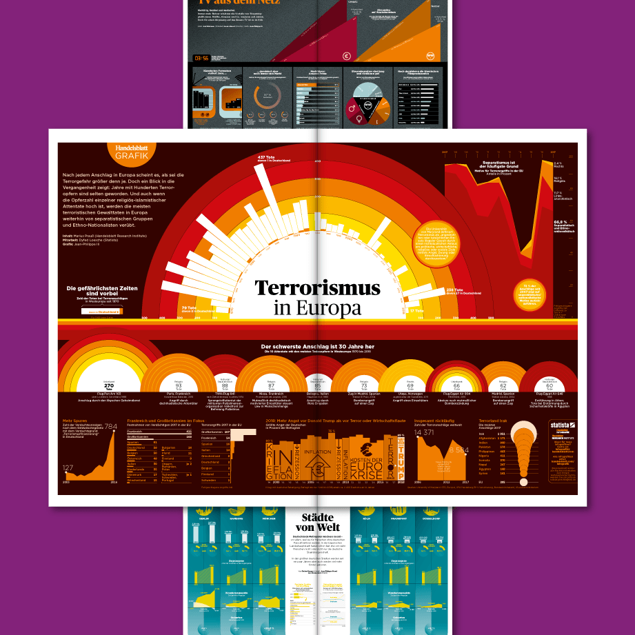
The ’Graphic of the day’ in Germany's leading newspaper ’Handelsblatt’ for economics and politics.
By JPdoes November 26, 2022
Design of a daily infographic system translating complex economic and political topics into clear, consistent visual stories at editorial scale.
More Posts