
Measuring Berlin: An infographics book about a city told through numbers
Die Vermessung Berlins — An Infographic Book About a City Told in Numbers
Translating hidden urban data into clear, engaging visual stories
Context
Berlin is one of the most written-about cities in Europe, yet many patterns that define daily life remain buried in raw data. Published by BeBra Verlag, this project aimed to uncover and translate those invisible structures.
My Role: Co-author, Art Director, and Lead Designer.

A Key Decision
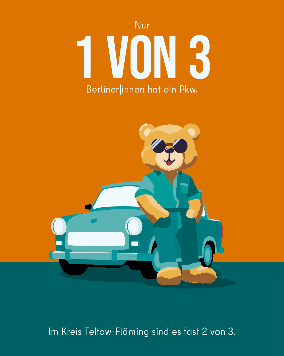
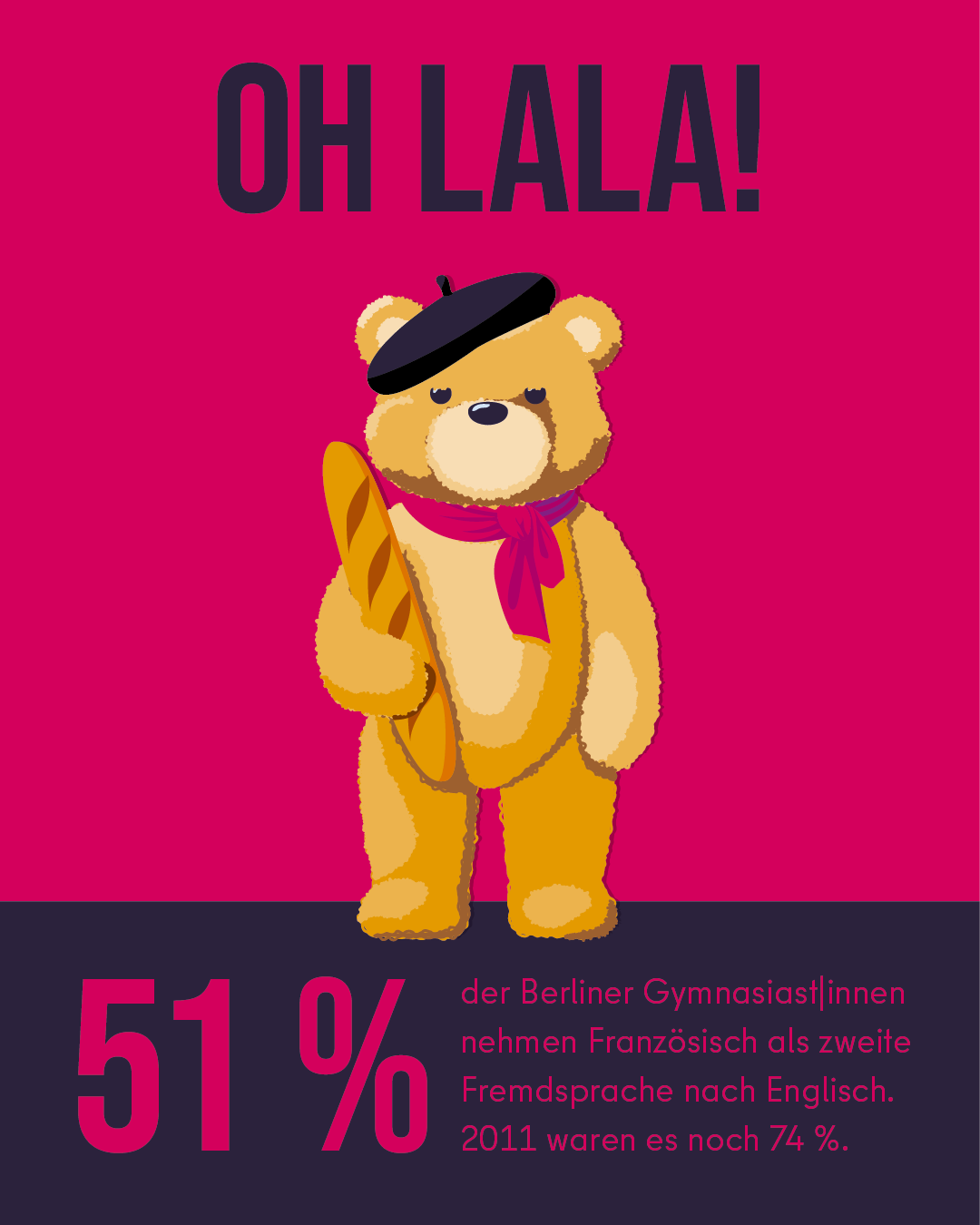
The Teddy Bear Motif I chose to pair rigorous data visualization with a playful visual tone, using a recurring teddy bear motif as a symbolic anchor. This made complex information approachable without compromising analytical precision.
What Was Delivered
- 50 Original Data Visualizations: Covering diverse urban topics.
- Complete Editorial System: A cohesive design language for the 128-page publication.
- Narrative Coherence: Balancing precision with emotional engagement.

Impact
- Publication: Released nationally in October 2024.
- Accessibility: Made complex urban data accessible to a broad, non-expert audience.
- Engagement: The "hunt for the bear" became a quiet game for readers, fostering deeper interaction with the data.
Why This Matters
Strong visual systems are not about decoration but about accelerating understanding. Even serious data can invite curiosity and joy.

Website & Online-Shop: Die Vermessung Berlins

How I improved coherence and efficiency in Netflix’s EMEA campaign localization by designing governance systems that preserve creative intent across markets.

Brand system and sales enablement work for Sensos, a logistics tech startup, designed to support C-suite communication, scalability, and consistent brand use.

Art direction work for Dyson focused on designing communication sub-systems that respect strict brand guidelines while solving specific, contextual needs.

Luxury brand system design for Agua de México, balancing cultural depth, restraint, and scalability to establish credibility without relying on large launch budgets.

Brand design and launch strategy for PUNCHIE, a hard seltzer brand entering a saturated FMCG market with a premium positioning and lifestyle focus.

Internal communication design for Continental, translating knowledge-sharing principles into a scalable visual system that supports clarity and reuse.

Handelsblatt — Student Campaign on Instagram Stories Year: 2021 Context: Digital campaign for Handelsblatt targeting students. Market research had shown untapped potential in this audience, particularly through Instagram Stories rather than traditional digital advertising formats. My role: Creative Director. I led the creative direction of the campaign, defining the visual and narrative framework and guiding execution across formats. Project type: Digital campaign · Social media advertising · Creative direction

How design systems were used at WirtschaftsWoche to break organizational silos, align teams, and create sustainable cross-media communication structures.

A mobile-first infographic production system enabling fast, responsive editorial output without coding, reducing complexity and supporting sustainable workflows.

Design of a daily infographic system translating complex economic and political topics into clear, consistent visual stories at editorial scale.