Continental: Internal Communication

Continental — Designing Internal Communication as a Knowledge System


Role: Creative Direction & Communication Design
Year: 
2021
Focus: 
Internal communication · Knowledge sharing · Design governance · Organizational clarity


Context:

Continental is a global technology company operating across highly specialized domains, markets, and internal cultures. As in many large organizations, knowledge tends to accumulate in silos: teams develop expertise locally, but insights, learnings, and best practices often fail to travel efficiently across the organization.

The project “Learn, Share, Improve – the Yokoten way” was initiated to address exactly that problem: how to make knowledge transferable, visible, and reusable across teams.

The Challenge

The core challenge was not visual design — it was adoption.

Internal communication initiatives often fail when they:

  • Feel imposed rather than useful
  • Are visually disconnected from daily work
  • Lack clarity on what people are expected to do with the information

Continental needed a communication format that:

  • Encouraged sharing without adding complexity
  • Was instantly recognizable and easy to understand
  • Could scale across departments and topics
  • Supported a culture of continuous improvement


My Role

I was responsible for creative direction and communication design, working at the intersection of strategy, clarity, and usability.

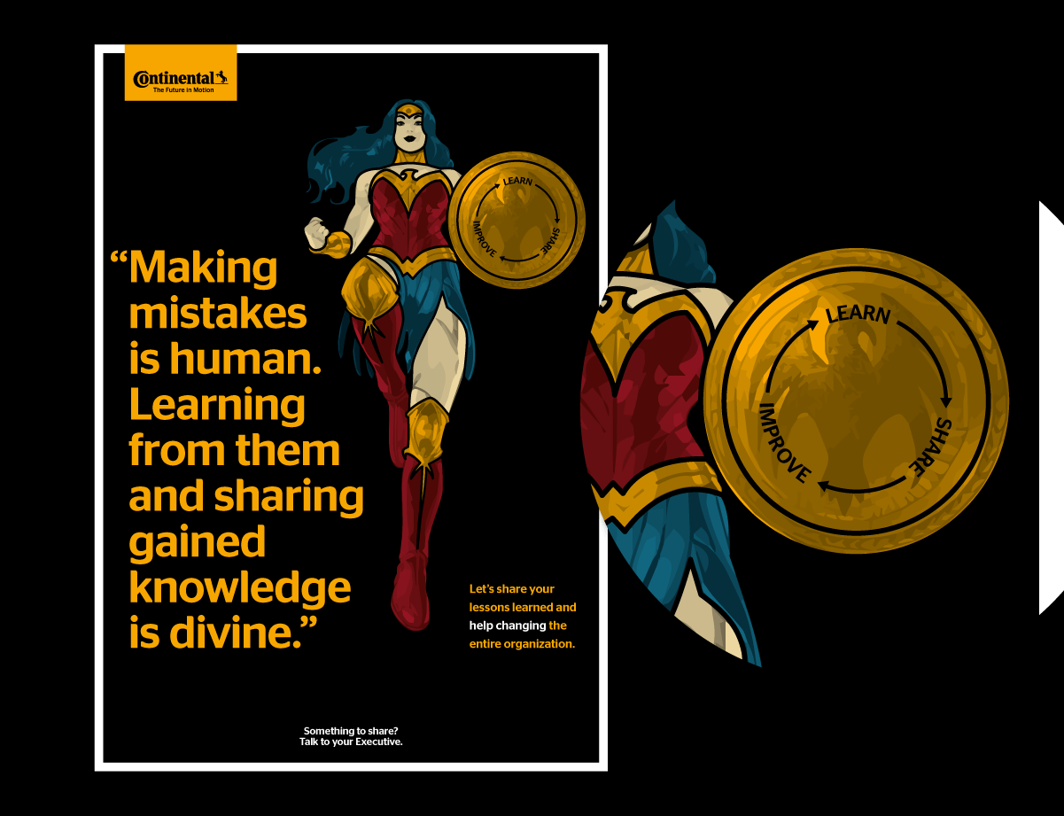
My task was to translate an abstract organizational principle — Yokoten (horizontal knowledge sharing) — into a practical, visual communication system that teams would actually use.


Designing the System

Rather than designing a one-off campaign, I focused on creating a repeatable communication framework.

Key design decisions included:

  • A clear, modular visual structure adaptable to different content types
  • Strong hierarchy to guide readers through complex internal topics
  • A consistent visual language that could be reused without redesign
  • Formats suitable for posters, presentations, and internal channels

The system was designed so that new content could be added easily, without requiring constant creative reinvention.
Impact

  • Improved visibility of internal best practices
  • Easier sharing of learnings across teams and departments
  • Strong recognition of the format within the organization
  • A communication structure that could evolve over time

Most importantly, the design reduced friction: it made knowledge feel accessible rather than abstract.


Why This Matters

Internal communication is often underestimated as a design challenge. In reality, it is one of the clearest tests of systems thinking.

When design supports understanding, reuse, and clarity, it becomes an enabler of organizational learning — not just a visual layer.

This project reinforced a principle that runs through my work:
good design doesn’t just communicate messages — it 
changes how organizations operate.

A variety of posters from Netflix productions spread out on a black background.
By Jean-Philippe Ili January 28, 2026
How I improved coherence and efficiency in Netflix’s EMEA campaign localization by designing governance systems that preserve creative intent across markets.
Sensos logo on a cinematic black background, representing a bold, high-tech brand identity
By Jean-Philippe Ili January 21, 2026
Brand system and sales enablement work for Sensos, a logistics tech startup, designed to support C-suite communication, scalability, and consistent brand use.
Book cover of “Die Vermessung Berlins” with red background, yellow bear illustration, title text, an
By Jean-Philippe Ili December 19, 2025
Measuring Berlin is an infographics book exploring unexpected data about the German capital, visual storytelling, and the making of a first publication.
Dyson’s Supersonic: The revolutionary hair dryer is the only visible object in a pitch black room.
By Jean-Philippe Ili February 2, 2024
Art direction work for Dyson focused on designing communication sub-systems that respect strict brand guidelines while solving specific, contextual needs.
Agua de México, 1840 Edition: Tequila Blanco, Reposado and Añejo.
By Jean-Philippe Ili January 14, 2024
Luxury brand system design for Agua de México, balancing cultural depth, restraint, and scalability to establish credibility without relying on large launch budgets.
A sunny background and a mouth full of life in the front: Get punchie!
By Jean-Philippe Ili November 7, 2023
Brand design and launch strategy for PUNCHIE, a hard seltzer brand entering a saturated FMCG market with a premium positioning and lifestyle focus.
By JPdoes December 1, 2022
Handelsblatt — Student Campaign on Instagram Stories Year: 2021 Context: Digital campaign for Handelsblatt targeting students. Market research had shown untapped potential in this audience, particularly through Instagram Stories rather than traditional digital advertising formats. My role: Creative Director. I led the creative direction of the campaign, defining the visual and narrative framework and guiding execution across formats. Project type: Digital campaign · Social media advertising · Creative direction
 An ad for the German magazine WirtschaftsWoche showing a confident female founder
By JPdoes November 29, 2022
How design systems were used at WirtschaftsWoche to break organizational silos, align teams, and create sustainable cross-media communication structures.
A smartphone displaying the top of an interactive infographic dossier – a long read, in graphs only
By JPdoes November 28, 2022
A mobile-first infographic production system enabling fast, responsive editorial output without coding, reducing complexity and supporting sustainable workflows.
The ’Graphic of the day’ in Germany's leading newspaper ’Handelsblatt’ for economics and politics.
By JPdoes November 26, 2022
Design of a daily infographic system translating complex economic and political topics into clear, consistent visual stories at editorial scale.
More Posts